First Hand Look at the iOS7 Beta
Apple announced a big iOS re-design at their WWDC on Monday, but how exactly does the new design fare?
I have always said it; the design of iOS is behind the times. Since iOS was released in late 2007, along with the very first iPhone, not much has really changed with its' design.
But now that is all going to change. On Monday 10th June 2013, at their WWDC, Apple unveiled the next in line of their mobile operating systems. And, like the rest of the geek community, I was there, streaming the whole event on my iPad, wondering what tricks Apple would announce next.
As an Apple iOS Developer, I am able to get a first hand look at the iOS7 Beta, so here are my initial thoughts and potential issues.
Re-Designed Icons
It seems the centre of everyone's attention with the re-design is focused upon the new app icons. Firstly, I think that a re-design was definitely in need, but I feel like the icons are inconsistent with the rest of the re-design, and some feel like they were made at the last minute just for the beta release.
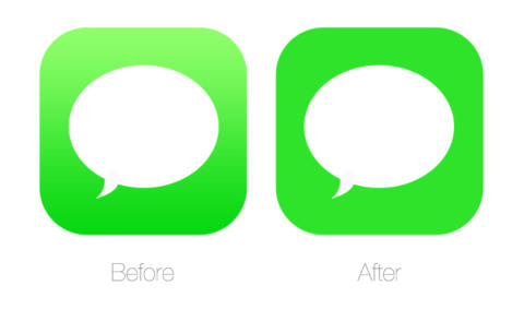
Allow me to elaborate. The new path for iOS lies with a ‘flat design’, and I think that the rest of the OS looks fantastic; the new notification centre and weather apps are a favourite of mine. But when you begin to use background gradients in the app icons … on a flat design … sorry Mr Ive, it just doesn't do it for me. Here are two examples of what I mean:

Notice how cleaner the weather icon looks with the gradient from both the background and the sun removed and changed to a solid colour.

Again, the same effect can be seen here with the messages icon.
Brand New Interface
The new interface to iOS7 is definitely a much needed breath of fresh air. Everything feels a lot cleaner, with all the previous gloss and emboss replaced with much sharper lines and solid colours.
At the moment there is plenty of room for improvement with the OS, but of course this can be expected on the first beta release. Hopefully during the development process, Apple will fix these issues and a much more complete OS will soon be rolling out to developers.
The lock screen has always been screaming out for a re-design, and we have finally got one! The new screen boasts a much cleaner and minimalistic design, and now you don’t have to see the ugly battery while you are charging. The new passcode lock design is also a much needed improvement.
A few subtle changes that can be seen include a re-designed top bar section, with a new battery icon, and signal bars changed to circles that fill or remain empty according to signal strength.
UX Improvements
Along with changing the look of iOS, Apple have made some fantastic improvements to the user experience. Everything feels a lot more fluid, with the subtle introduction of open/close app animations, and also a nice fade in/out as you sleep and wake the device.
Two types of dynamic background have also been introduced, a feature which iOS has always been lacking. The first is a collection of animated wallpapers, with elements in the image moving around the screen as you rotate the device. The second is just a static background, which also moves around as you tilt the device, creating a nice sense of dimension.
Another great feature which has been added is the Control Center, which can be accessed from swiping up from the bottom of the screen. A favourite for jailbreakers in the past, this feature allows you to control your phone settings, ie WiFi, Bluetooth, Airplane Mode and brightness from anywhere, without the need to go into your settings.
It seems that Apple have been looking into tweaks brought forward from the jailbreak community, and using them to help improve the iOS; a few years too late!
Performance Issues
One of the problems I have faced while using the iOS7 beta is a lack of performance from my iPhone 4S. I am not entirely sure if this is down to me using the first beta release, or if indeed the older iPhones aren’t capable of running iOS7 smoothly. Either way, the performance was very poor, and it definitely can’t continue into the full release.
Also, while testing out the beta, I went through 50% battery in about half an hour. Again, I really hope this is just an issue with the beta and should hopefully be addressed come the full release.
I think that, for a first beta release, Apple have almost got it right. I hope the huge backlash with developers about their new icon set will be enough for them to re-think their approach.
With so many improvements to be made, I’m very much looking forward to the second beta release!
You might also like...


